|
My art has evolved over the years from simple pencil portraits - (My original business name was Portraits in Pencil) to include many forms of creativity.
I used to think the way to grow as an artist was to focus on one element and only do that until I achieved a level of precision and skill. To a certain extent I still believe that is true, however, I've discovered that many of my "side projects" have enhanced my skill in other areas. For example, learning the medium of watercolor brought a depth of understanding the elements of value and contrast to my pencil portraits that I may not have found if I had limited myself to only pencil drawing. Watercolor card making led me on the adventure of intaglio print making which ultimately opened the door to glass engraving and eventually to doing hand painted items for a local glass blower. (THANK YOU, Martha Reynolds and Chip Turner for your time and teaching!) I've now managed to have a retirement filled with new opportunities that keep me busy doing what feeds my soul every day while allowing flexibility to devote time to family and friends. 2024 looks to be an exciting year, I can wait to see where this road takes me!
0 Comments
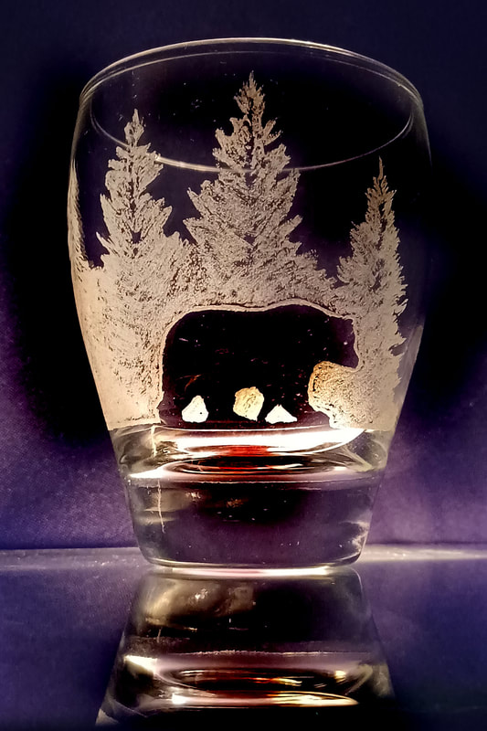
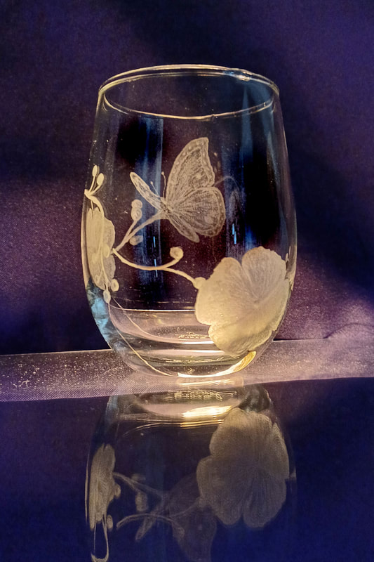
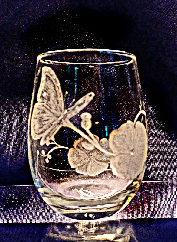
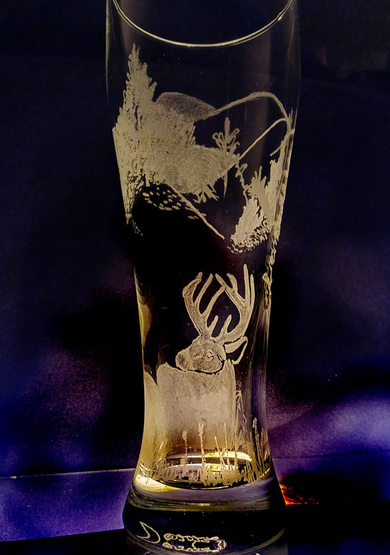
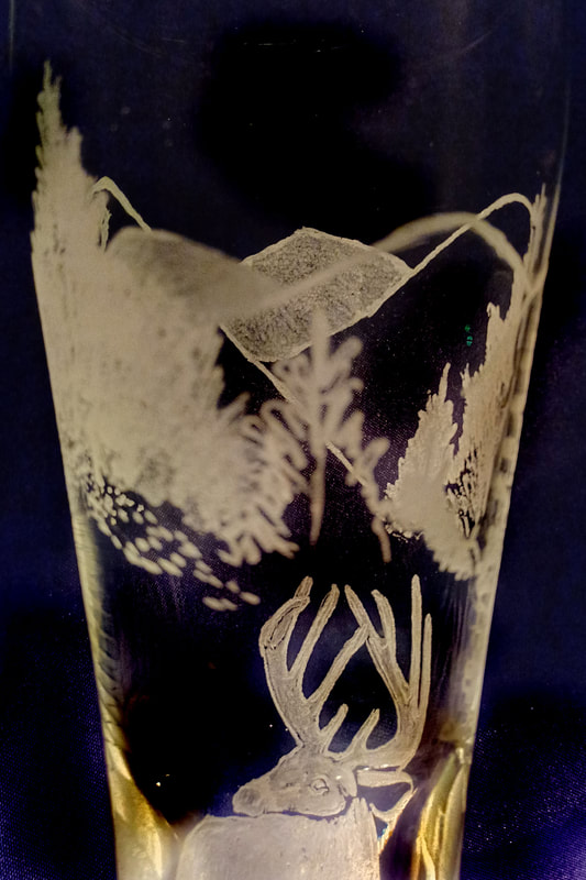
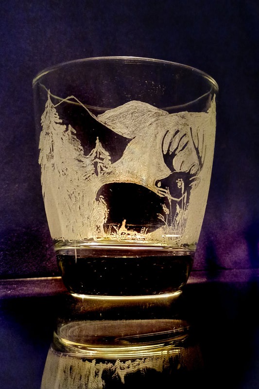
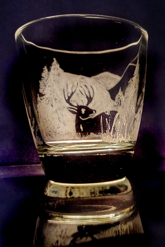
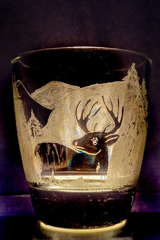
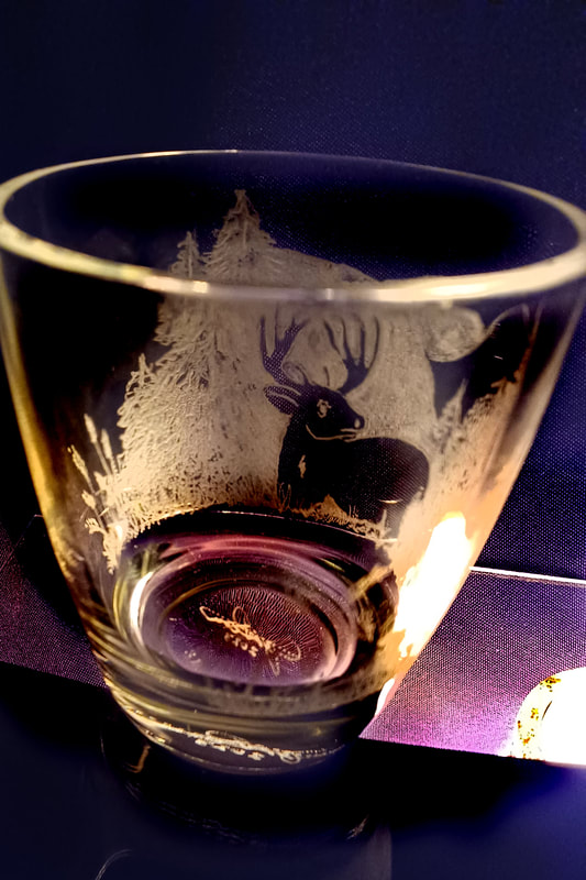
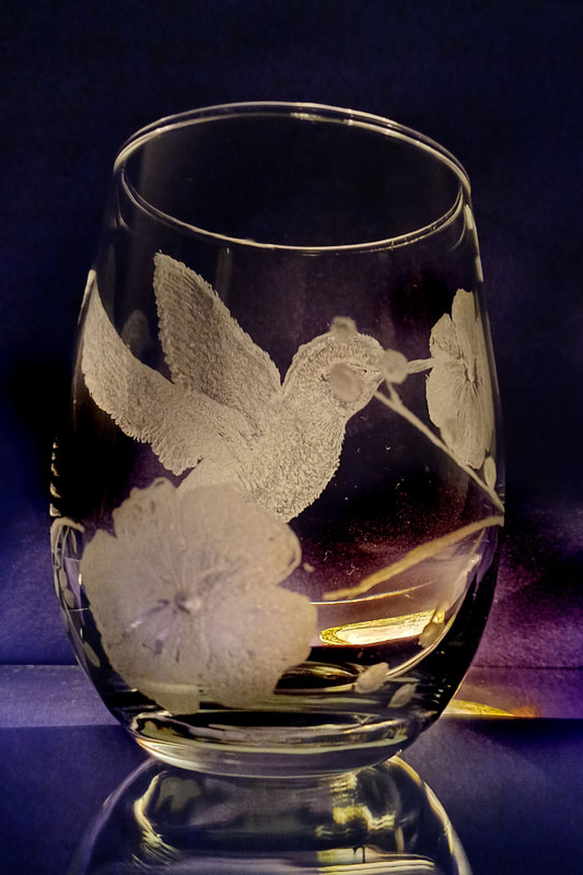
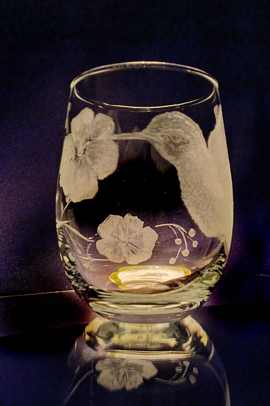
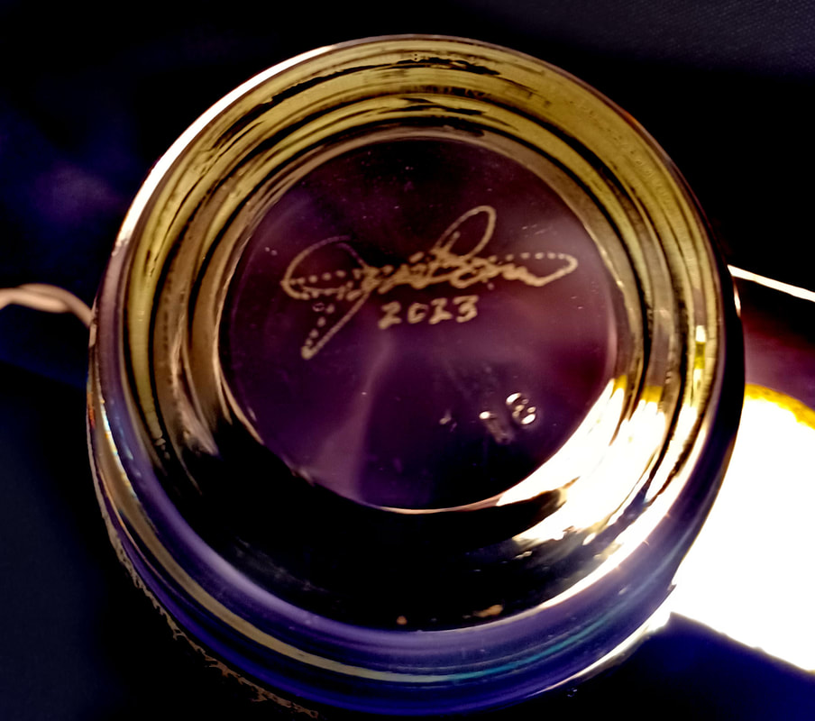
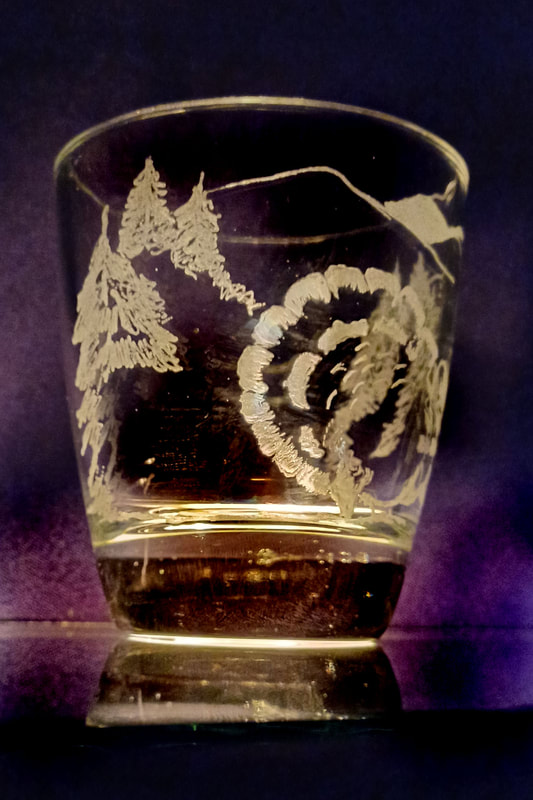
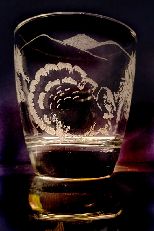
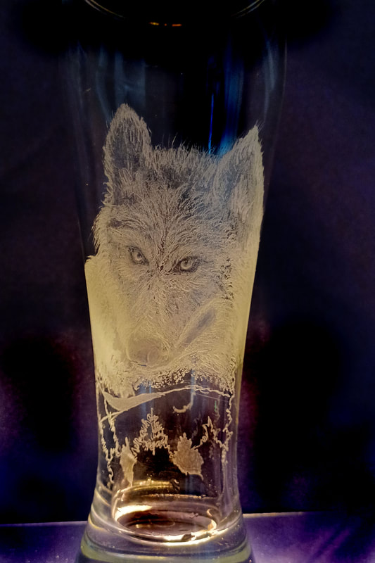
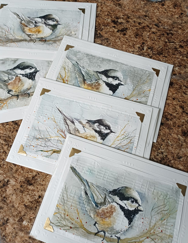
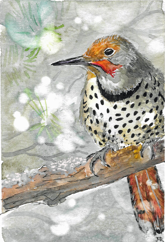
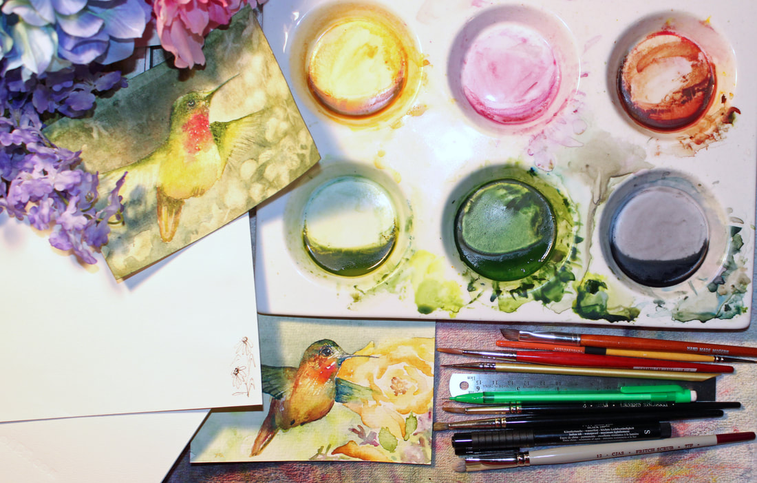
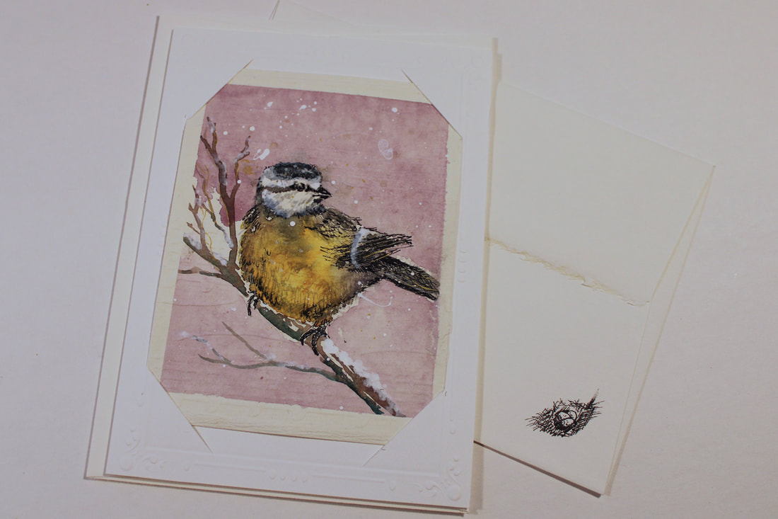
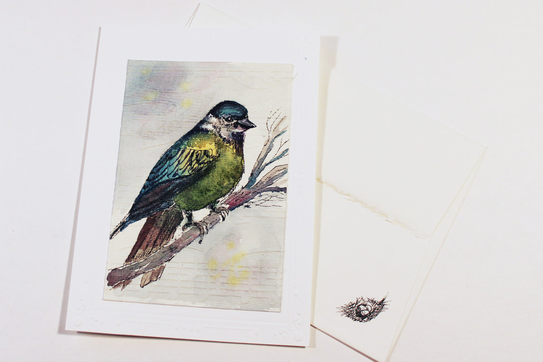
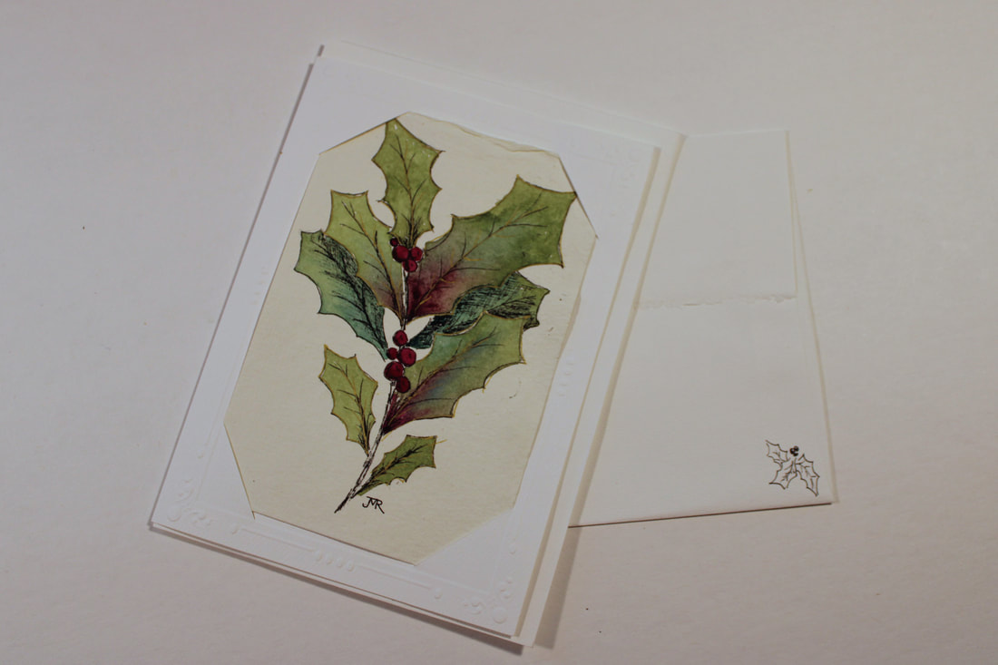
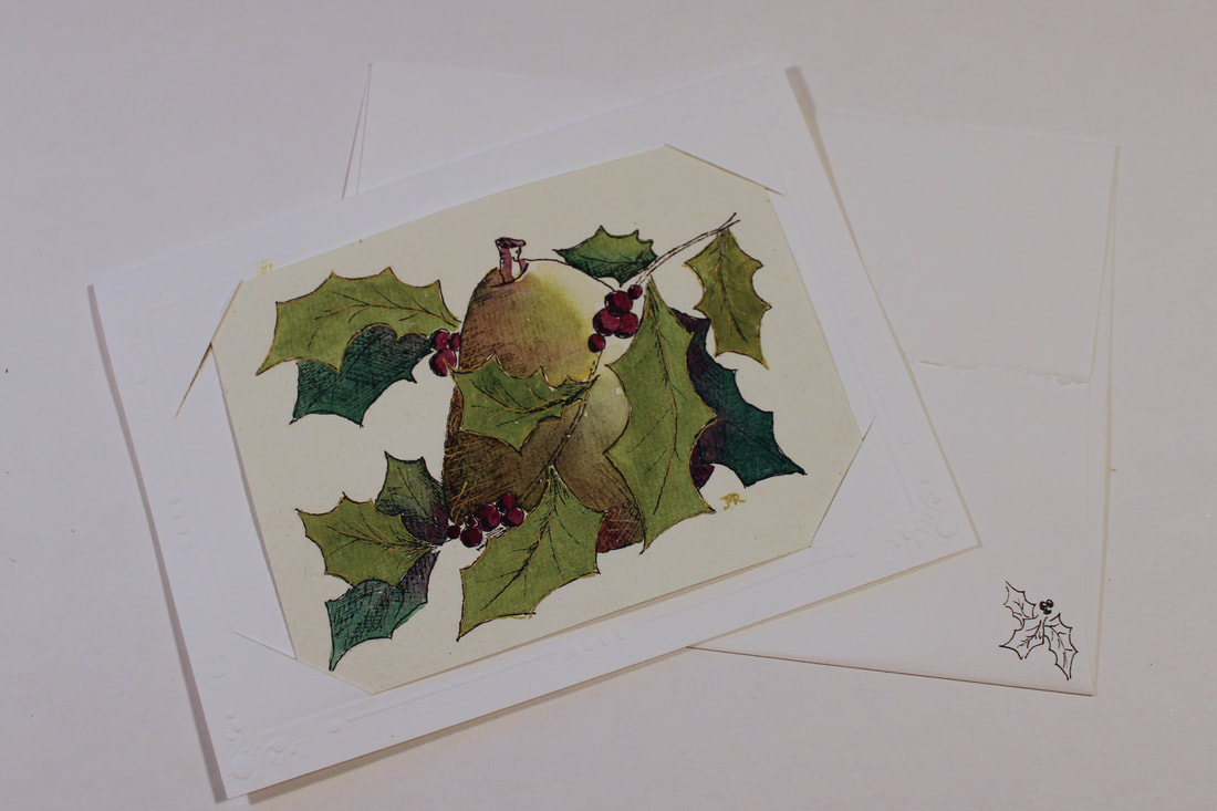
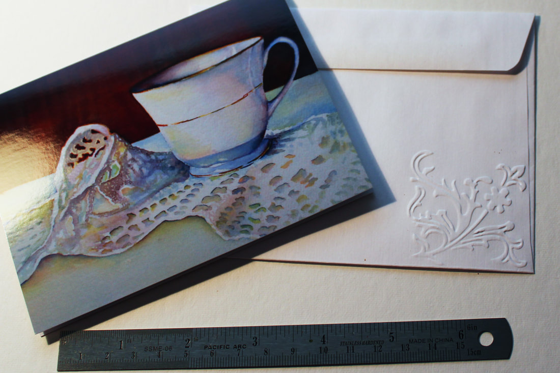
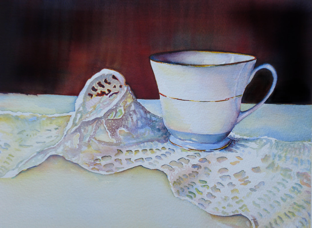
I worked in 2022 on my notecards for Etsy and local shops trying to find a consistent way to produce them while still keeping the individually hand done quality to them. I began learning Intaglio engraving for plexiglass to make prints of my bird drawings which I could then watercolor. While I've always been an avid pencil sketcher, I discoverd a new way of drawing with the stylus and tools that took my drawings from flat paper to a 3 D plate. I loved the look of the plates after they were carved even before I printed with them! As I was researching the printing process, I stumbled upon an amazing world of etched glass and decided to try my hand at it making Christmas gifts. I enjoyed this process so much that I am now hooked on seeing how far I can go. Many THANKS to Lesley Pyke YouTube channel (Paints with Diamonds) for sharing her sense of humor and amazing talent as I learn how to create in this medium. https://www.lesleypyke.com/ Here are a few of the glasses I've completed. I also didn't realize what a BIG project it would be to photograph the work once I was ready to show them. I feel like I learn something new with each one - isn't that the point?!! Happy Painting! (and, whatever else you get into!) It's hard to believe more than a year has passed since my last post. I've had many small projects to keep the creativity flowing. Mostly original note cards, photography and small paintings. Painting the note cards helps build skills and consistency and makes me feel like I am at least accomplishing something while life is changing. I'm now retired from my full-time career of 32 years (for 2 months) and I'm amazed at how busy I can be! Artist Jeanne Brenneman once told me "There's more work to do in the studio than painting." I have always tried to remember that and am now really taking it to heart by sorting and organizing supplies and putting together a box to share at an upcoming workshop. AND starting new paintings. I have always kept an idea book for paintings, so it makes it easier to re-visit and dive in. I find it especially fun when I read the notes and see the thumbnails and get inspired all over again. (The flip side to that is reading the notes and saying, "What was I thinking?!?") Hope you enjoy the updates! Here are some new images . :) I found this porcelain muffin tray in the back of my art storage. I vaguely remember getting it (on Clearance, of course!) several years ago. The wells are 3" wide and 1" deep, which allows plenty of room for adding water and mixing paint. The whole thing is 12" x 12" so won't be good for travel, and it takes up more room on my work table than I am used to. What I do like about it, I discovered after spending a few weeks painting from it is that I am able to "organize" my palette. Here's what I mean.....
I actually only use three colors - Daniel Smith New Gamboge, Daniel Smith Quinacridone Violet and Winsor Newton Antwerp Blue. Every other color you see is a combination of those three - even the "grey" you see in the bottom right corner. I was able to get what I needed for the Humming Bird Card project - a light green, dark green and a complimentary purple, and I had enough wells to mix and isolate the colors to keep them fresh. Of course, I still used the flat spaces between for testing mixtures, but the glass surface wipes easily with a paper towel. My table also tilts a little, so there is a nice puddle of rich pigment at the bottom of each well that I can swish up and around when I am loading my brush. So far, I am liking the process. This probably has more to do with finally sitting down consistently to paint. The note cards are small practices that I can complete quickly while honing my skills on a new subject. I'm ready for Spring and Sunshine! :) Happy Painting! Prince Charming--- Sometimes I get ideas for painting just by hearing someone talk about their life or experiences. I was listening to a coworker talk about her little girl who is very girlie but yet would not be afraid to pick up a frog or snake. That snippet gave me the idea for this painting-- "Prince Charming". I totally give the credit for the idea to the mom and plan to gift the painting when I am done. The composition is a composite of my niece holding a cell phone and many, many trials and errors at posing the crossed legs. I searched through all my reference photos for just what I had in mind. I had an idea about how to do the tutu from an earlier painting of my daughter dancing with her doll. I experimented with squares of complimentary colors to give the background texture and define the edges of the tutu. My color palette consisted of Quinacridone Red, New Gamboge, and Antwerp Blue. The green of the frog was a combination of the three. The purple is supposed to compliment the green, but I'm not sure I pulled it off. I did the black and white value photo near the end to gage where to punch up the contrast. (I always like the black and white better than the color--- it just seems more dramatic.) I used the bottom 4 inches of my paper to experiment with the confetti squares, and was a little disappointed when it didn't fit into the finished composition. I had the shoe ties curling off the paper which lead away from the girl and frog center of interest, so I cropped them out with the matting. So--- the big question is..... what's gonna happen when she kisses him?!! I had a photo of my daughter being fitted for her wedding dress. The Dressmaker was a painting from the time I took the photo. Five years later, I am finally getting to paint it. The original photo had poor lighting and a cluttered background. I used my photo program to exaggerate the lighting and printed a highly contrasted reference photo. To go along with the theme of my painting, I used India paper, which looks rough and "handmade". It has imperfections that look like fabric and really soaks up the water and paint. You can lift out, but must be careful. I "invented" a watercolor eraser by wiring a strip of micro cleaning sponge around the tip of an old brush. This helped me be more exact about lifting without scrubbing too hard.I also used the traditional sketchbook value study with pencil and water so that by the time I got to draw on the paper, I was very familiar with what I wanted to do. I used rabatment to enlarge the photo to fit the paper, being careful not to erase much and leave any ghosts on this soft paper. This was important, because usually when I am excited about a painting and plunge right in, I end up struggling to correct mistakes that should have been worked out before. I had been watching an art series about old Masters and Rembrandt "Chiaroscuro". This painting begged to be painted with that as inspiration. I left out the clutter in the background but added a mirror to reflect us watching my daughter in her special moment. While the painting is essentially a portrait of this talented seamstress, this is one of those paintings I've done for myself. As I painted, I thought back to all of the memories we made during the preparations for her big day, and truly enjoyed the process. Happy Painting! :) 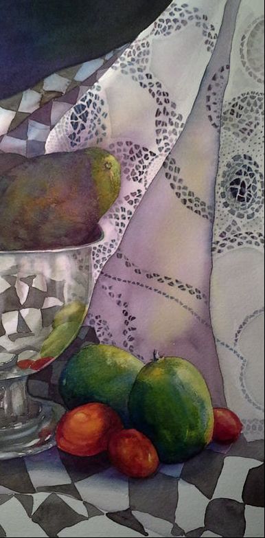 Finished! Guacamole- Still life with Avocado, Limes and Cherry Tomatoes. I love the complimentary violet-green combination- that happened quite by accident, but once I realized what it was doing I exaggerated it even more. I still think the avocado could be darker, but I hate to lose the glazing effect, so it will have to be a little unripe for this one. On to the next in the series! :) This week I continued working on Still Life for an upcoming exhibit. I found some great avocados and cherry tomatoes in my kitchen and went in search of a shiny metal pitcher for reflections. I only found this pedestal bowl, which would be perfect for a fresh batch of Guacamole. I wanted to continue the practice with the lace but liked the idea of the red and green against the black and white checks. I challenged myself to make the avocado NOT look like a pear, but that may be a lost cause. I did end up with a wonderful glazing layered effect and learned a lot. ( After I was finished, I happened to think I shoulda used my glass pitcher filled with sangria... maybe not a good idea after all....) |
AuthorI think it is important to share our process with others, just as we gain from watching other artists work. Archives
January 2024
Categories |


 RSS Feed