|
I've spent the past year getting settled in our new home and re-learning how to paint. My new cubby actually has windows and the best morning light, so I look forward to early weekend mornings with coffee and watercolor. I've been working on developing landscape techniques but took a break and began work on this still life for an upcoming exhibit. I used a reference photo for the lace but made my own design and simplified the pitcher. The reference photo was striking in color, with a grey background and colorful fruit. I printed it in black and white so I could concentrate on the contour of the fabric. The detail in the lace shows strands of lace folded behind which helps to bring out the dimension in the lace. I used one of my own photos of a metal gravy boat and quilt to guide me in achieving the metallic look and reflections in the pitcher. (Not quite there yet, but heading in the right direction I think) Of course, pears are always fun and a great way to loosen up after painting tree branches. Painting the lace became like a very complex doodle and was in a way very relaxing. (It is hard to fret over work when you are concentrating that hard!)
0 Comments
I am excited to share some of the projects I've been working on, especially the portraits I've been completing using both my favorite media- watercolor and graphite. This portrait of a graceful child was fun to do because her gaze captivated me during the whole process. While I usually enjoy the contrast of the black & white, I ventured into adding spots of color, especially in the eyes, to give a unique finish to the portrait. 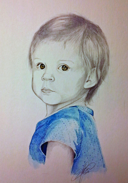 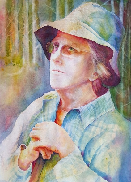 Finally completed this past Summer, "Take a Hike" won award of merit in the 2016 WVWS All-Member exhibit at Parkersburg Art Center. The portrait will be a gift to the lady in the photo who has always been an inspiration of character and life long learning.
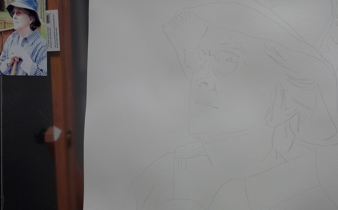
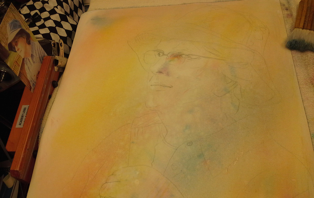
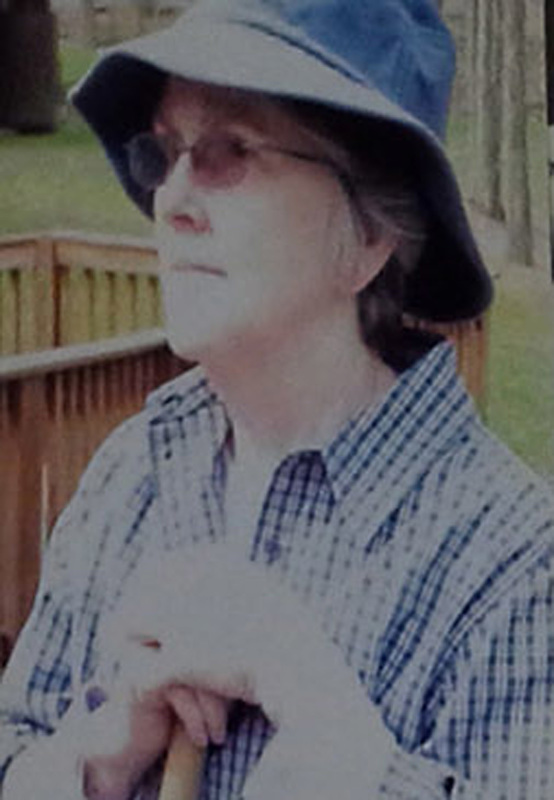
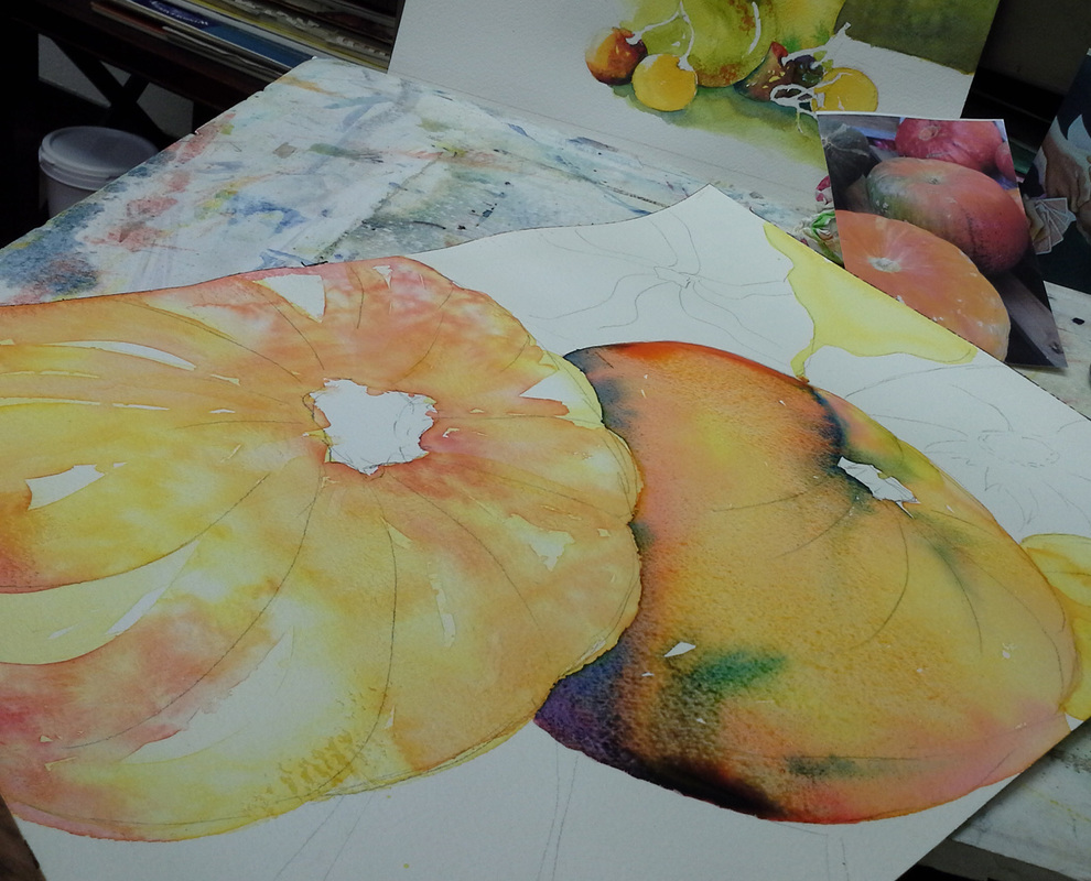
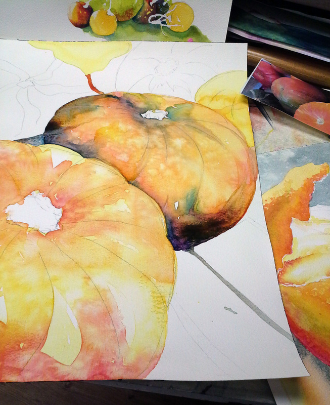
The finishing touches of the trees were problematic for me until the Jean Gill workshop at Timberline, where she demonstrated FRITCH scrubbers. I had always used them to "erase" mistakes in watercolor. The technique of using them to actually add interest was just what I needed to finally complete this portrait. Before that, I would stand back and say "What does it need?" Funny how sometimes it is what you take out that makes the difference! Thinking Spring has gotten me thinking about outdoor activities, but I was in the mood to do a portrait and maybe just "practice" on some flowers or landscapes. A phone call from a dear friend fit right in, prompting me to dig in my photo bin. This reference photo was taken on my first ever "Nature Walk" . Looking for spring wildflowers, I was of course doing my usual people watching, collecting faces for reference. I had taken this photo from a distance, and didn't realize right away I actually knew this wonderful lady! Judy is a master gardener, basket maker, and amazing calligrapher. She has always inspired me with her down to Earth style and calming personality. I am just working on the underpainting, and am going to try something a little different. I am planning to do the value study in New Gamboge, then do a "mask " of gesso. I've experimented with this on still life over the winter, and want to try on a portrait. my idea is to have the "underglow" come through the transparent watercolor on the surface, adding a new dimension to my portrait. This painting has been in my cubby for two years. I've had the photo of my niece Kaitlyn for several years, and it is amazing to see her transformation from this sweet child on Santa's knee to the beautiful young lady she has become. The painting 's not quite finished, I'm still working to overcome the frisket issues. The lesson I learned from this painting is either NOT to use frisket, or to only use it if you are going to complete the painting within a short amount of time. Let it suffice to say that two years is definitely too long to leave it in place, and it is a real bear to remove. I was going for the sparkles in Santa's beard and Kaitlyn's hair, but think the painting would have been better off without the frisket. Make time to enjoy the Holiday, because time passes way too quickly! :) 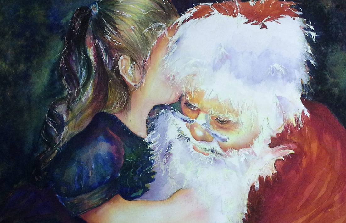 The workshop this past Summer with Jeannie McGuire helped me to take a second look at this painting. I was struggling with the composition-- I wanted to express the energy of winning the race. I liked the color flow and the sunlight/shadows, but somehow it was like just copying the photo. After the workshop, I put the painting away, not sure where to go with it, and sorry that it wouldn't be ready for the Princeton show. I kept it at the back of my mind wondering how to get the feeling of "air" without actually painting those great shadows under their feet. After much mental hashing, I took the message from Jeannie McGuire, which was to keep only the basic elements of the photo reference and try to let the painting speak for itself. After all, the viewers don't see the references, only the finished product. I can almost see what the painting will look like when finished, which is a good sign, I'm hoping. My "new" version of "Sack Race" has only small bits suggesting the sacks, but I'm hoping the sunlight and facial expressions say the rest. --I'll keep you posted! :) 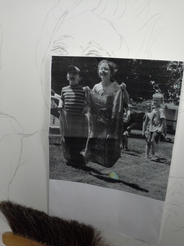 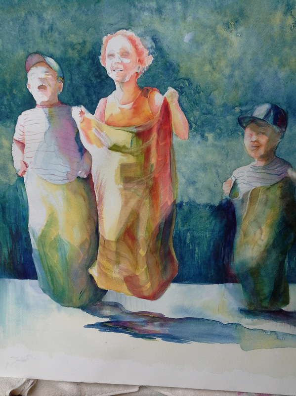 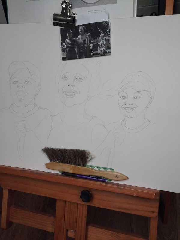 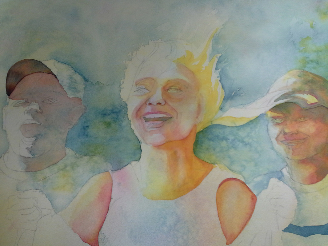 I 'm taking advantage of the long Columbus Day weekend to work on several small paintings. A recent trip through the mountains to see the Fall Colors got me in the mood for pumpkins, and I'm really enjoying letting the colors FLOW. Using the limited palette of New Gamboge, Antwerp Blue, and Quinacridone Crimson (all transparent), I am finding the "Happy Accidents" of purples, greens and soft greys. This kind of exercise I consider to be "mental YOGA"-- I am not focusing on anything, just applying the paint and water and watching the magic happen. I'm not painting pumpkins, only focusing on contrast, light and dark areas. VERY relaxing. Very simple drawings. Great experience. Have a Peaceful Day :)
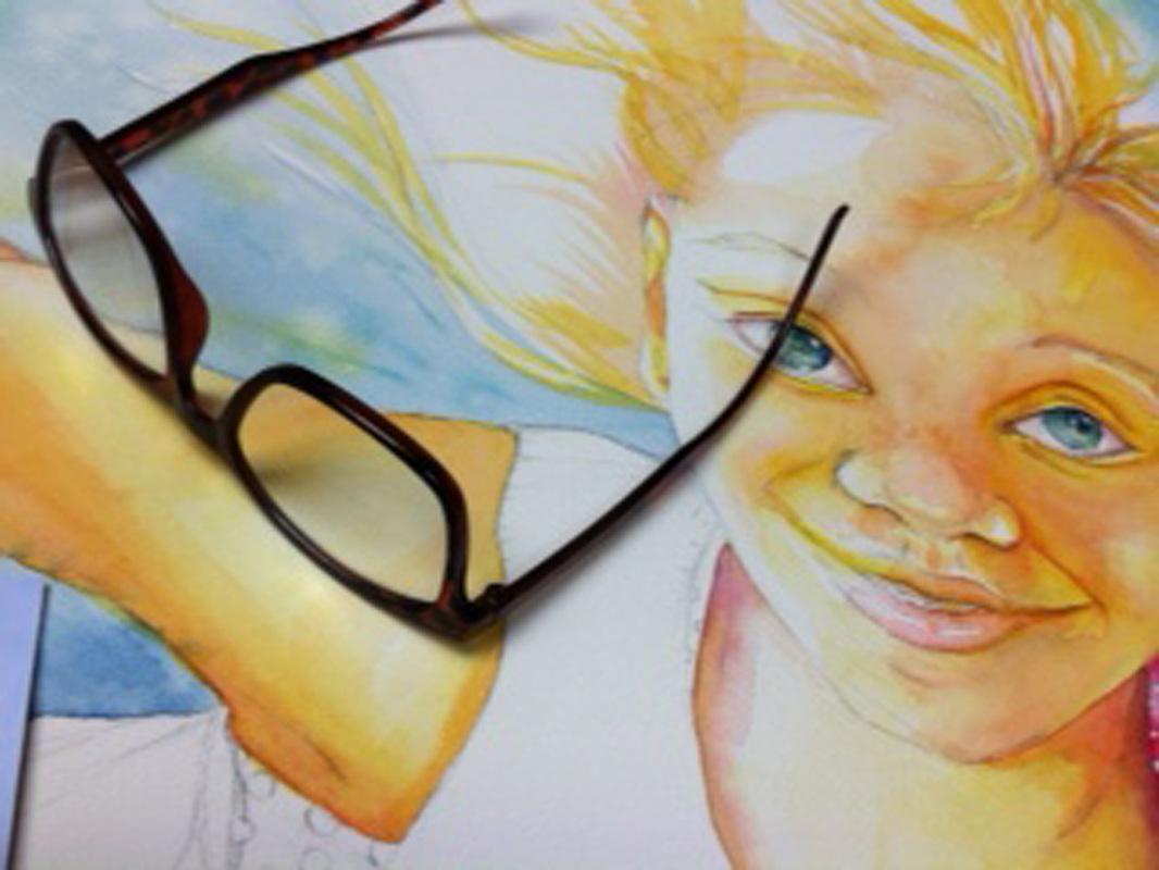
I have been working all Summer to get ready for the show in Princeton. While I did record images as I went along, I didn't take the time to post, so I will have lots of material to share over the long, cold Winter! One BIG change I had to make in my process --- the use of "readers" for the detail work. It was one of those things where you don't realize how much you are struggling to focus until one day (when nobody was looking) I tried on my husband's readers, and BEHOLD! a new, clearer world! Really, it wasn't that dramatic, but painting the eyes and small details is one of my favorite parts of a portrait. Seeing the magnified image helps me to "get inside" and focus on the detail. I have always used a craft lamp with a magnifier, but the glasses made a great difference. ( I have ALWAYS celebrated "accumulated mileage", only now I am having to use the accessories, and it sneaked up on me!) This painting, "I BELIEVE I can Fly!" makes me happy. I hope this transfers to the viewers when it's done. I used several photo references, but the end result is a happy child totally from my imagination. The hands supporting her are a big part of the story, and the viewer can make up their own story. I went through several pencil versions trying to decide the expression: eyes open, closed, looking up, etc. I settled on this expression because of the eye contact. I think her serene expression says, "I BELIEVE I CAN FLY!" :)  Finished painting of "ITSA Your Move!" reminds me that when I am presented with any obstacle in life, it's in my hands to choose to manage in a positive manner. Not always an easy task, so it is good to be reminded each time I walk into my cubby! :)
Have a Nice Day! :) Is the date really May? I may not have been posting, but have been busy painting. I've also been involved with several other projects and a hectic work life that sometimes gets the best of me. (I even missed a WVWS deadline) It is very easy to get overwhelmed by negative thoughts when you don't take the time to purposefully create a positive mindset. I used the "anchoring" tool this past week to help me "snap out of it"--- We have a lot of remodeling going on where I work, and "Wet Paint" signs were posted all over near my office. I arrived at work in a "Cloudy" mood, but when I saw the "wet Paint" signs I instantly thought of the flow of watercolor paint on wet paper, a very relaxing exercise for me. I "stole" one of the signs and put it on the door to my office, where I would see it as I was coming and going during the day. Each time I brought up that mental image, I could feel the tension easing. Absolutely nothing had changed but my mindset, but it was enough to get me through some tough situations. 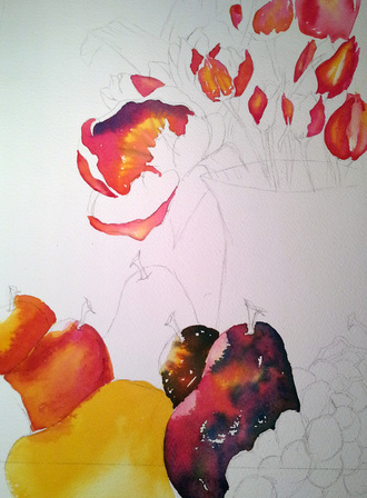 |
AuthorI think it is important to share our process with others, just as we gain from watching other artists work. Archives
January 2024
Categories |


 RSS Feed